10117 Artist Kenneth John KEN
my first official oil painting in december of 1998, i tried to paint a seascape and my blue was prussian blue. my goodness, what a mess, not only the painting of course, but the cleanup and everything around it. reminds me of the scene you see on tv, someone who cooks for the first time and the kitchen ends up being a complete mess, the food too.
prussian blue is the neatest and prettiest of all the blues, makes the neatest greens and browns. van gogh used it a lot. when it is mixed with white, it is very similar to cobalt blue. but cobalt blue has it's limitations, because it is not very dark in value. same as cerulean blue. ultramarine blue is dark enough, but too cool and not warm.
so why not use prussian blue all the time? because it is so powerful as a paint, that it takes over your whole palette. it is almost like using a thick ink, it has that much staining power. it takes a lot of courage to put it on your palette. if your using brushes, forget about using that brush with anything else. your yellows are instantly turned to green. you have to isolate it or even put it on another palette and use a separate brush. most artists are scared to death of it.
but it is such a beautiful color. and mixing your yellows with it, create some beautiful greens you can't get out of any tube of green. the best reducer of prussian blue is cadium orange, it makes the neatest brown-gray. add a touch of alizarin crimson and you basically have black. try it out, and you will get a love-hate relationship with it. good luck, and have plenty of solvent for clean up!
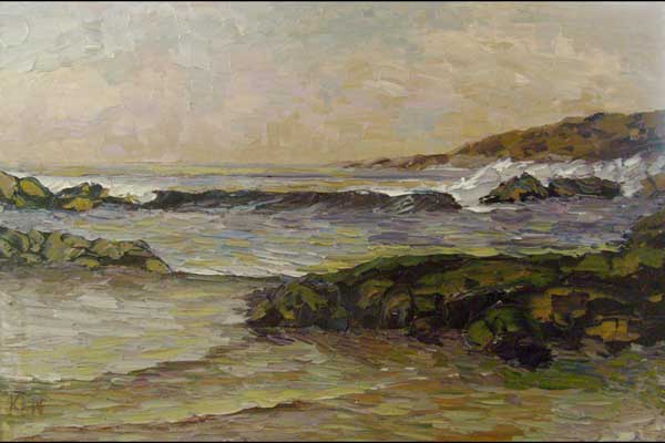
"orange dusk" palette-prussian blue, cadium yellow pale, cadium red, titanium white