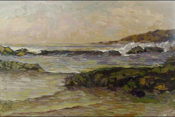
101307 Artist Kenneth John KEN
when you reduce or tone down blue with it's complement orange, it gives you a beautiful gray. i usually use a red and yellow mix (don't overmix) to reduce it because it leaves little streaks of each color in the paint that your viewer can't see unless they look really close, but those streaks really make your paintings vibrant. also, you can control the warm and cool scheme a lot better and lean your hues one way or another on the color wheel.
for example, if i want i grayish tint that leans toward green, i use a little more yellow in the mix. if i want the gray to lean towards violet, i put a little more red in the mix. if i use a straight cadium orange for instance, to reduce the blue, i only can get a orange tint to the gray. which for a very large painting or if you want perfectly consistant color, this might be the way to go.
"park regatta" palette- ultramarine blue, cadium red deep, viridian green, cadium yellow pale.
