Friday, November 23, 2007

Holiday Retreat

112307 Artist Kenneth John KEN


i generally take a break from painting for a few months over the holidays and winter. for several reasons, mainly to give myself a break from painting, so that when i hit it hard again in the spring, i am refreshed with new ideas. i use the time off to study, try new techniques and don't put any pressure on myself to perform to sell paintings. i work on all medias for fun and like to try new things.


i am currently developing a new ecommerce site, surpriseart.com that specializes in selling art and crafts educational books, activity kits and supplies for children and adults. check it out, there is and will be more and more very nice products that all aspiring artists and craftsman can try and use. check it out and bookmark or make it a favorite in your browser. email me and i can give you a code for a 10% discount. just tell me you read my blog.


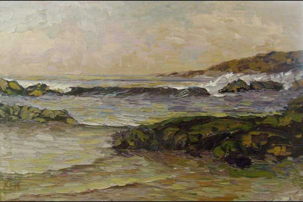
here are the last of my 2007 paintings. have a great holiday season. good luck with your art!!! ken


kenpaintings.com

Wednesday, November 7, 2007

Using Yellow

110707 Artist Kenneth John KEN


in this16x20" floral setting, i used 3 yellows: cadium yellow deep for the darkest values, yellow ochre for the mids and cadium yellow pale for the highlights. i tone them down with dioxazine purple. the base was dioxazine purple toned down with yellow ochre. the vase is cobalt blue toned down with cadium red deep and yellow pale. the greens were made with cobalt blue and the other yellows for the leaves and background. the reds are cadium red deep. titanium white was also used.


kenpaintings.com

Monday, November 5, 2007

Small To Big

Small to Big


110507 Artist Kenneth John KEN


before you make a larger painting and use a fresh new stretched canvas, you may want to make some small workup paintings to test the composition. i make several small paintings like these, use different color schemes, etc. i am not afraid to try wild and different things because i can either throw the small paintings out and no big financial or ego loss. the one on the left is on 6x8 canvas and since i like the composition and color scheme, i decided to make it into a 14x18 stretched canvas. the small paintings can be given away or sold or stored away.


on another note, i sell everything, even if it takes almost giving it away for nothing. i always figure at least i made a new patron, someone new to see my art. i lost my ego about my art years ago. not everyone is going to like your stuff, no matter how good you are. think about it, there are some master's works that you don't like. so of course, you have to not take it personally. just keep on truckin and believe in yourself (which is hard to do sometimes!!!).


kenpaintings.com

Thursday, November 1, 2007

Designing A Logo

110107 Artist Kenneth John KEN


when your doing some graphic design work for a client, such as a logo, you will have to come up with several ideas or layouts, these are called thumbnails. don't be modest about a bid on this stuff, it takes a lot more time to come up with something that looks so simple when finished. i spent almost 6 hours total to come up with these below and selected the third one down. you can see it at surpriseart.com, as it is going to be an ecommerce web site. (these show arial font, but the web site is going to be verdana font, which is very similar, both are sans-serif).


kenpaintings.com

Wednesday, October 31, 2007

Along the Klamath River

103107 Artist Kenneth John KEN


this scene reminds me of being in northern california years ago, along the coast, with it's many river inlets and coves.


22x28", titanium white, cobalt blue, sap green, yellow ochre, cadium red and yellow pale.


kenpaintings.com

Tuesday, October 30, 2007

Paint Fruit with Painting Knives

103007 Artist Kenneth John KEN


If you want to learn how to oil paint with palette and painting knives, i have authored 4 how to instructional dvd video's on oil painting. shows my techniques of using the knives. you can see some short clips of these video's at you tube or on my website.


____


kenpaintings.com

Monday, October 29, 2007

Limit Your Palette to Discover Colors

102907 Artist Kenneth John KEN


over the weekend, i painted these two impression paintings, one a still life and the other a seascape. painted them both with cobalt blue, cadium red deep, cadium yellow pale, sap green and titanium white. limiting your colors palette to the 3 primaries and green (there are some theorys that green is the the 4th primary) will allow you examine how the other tones of colors are made and why they appear as they do, especially the greens.


the main difference in greens is whether they lean towards yellow or lean towards blue. sap green leans towards yellow, viridian green leans towards blue. once you determine that, then they change tones by adding the complement.


____


kenpaintings.com

Friday, October 26, 2007

Realism Seascape Oil Paintings

102607 Artist Kenneth John KEN


if you want to sell more paintings, realism paintings are still the big sellers and i guess will always be. i have much more fun doing my impression paintings, but to make a few more coins, i paint my realism seascape paintings. you will use your earthtone colors a lot more when you want to paint realism. here i tone the blue down with raw umber and use yellow ochre with cadium red deep, cobalt blue.


compare this work with some of my prior impression paintings, like yesterday.


kenpaintings.com

Thursday, October 25, 2007

Still Life Impressionism

102507 Artist Kenneth John KEN


Bucket of Oranges - cadium yellow pale, cadium red, sap green, cobalt blue, raw umber


kenpaintings.com

Wednesday, October 24, 2007

California Wildfires

102507 Artist Kenneth John KEN


have been watching and thinking about all the fires in southern california. i lived in san diego for many years, have friends and relatives still there, i travel to san diego about 4 times a year and paint it's beaches a lot. i couldn't help but think about the northeast part of san diego county, rancho bernardo, escondido, fallbrook, poway, etc. i used to own a home in scripps ranch, which took some severe damage in the last major fires a couple of years ago.


in the northeast traveling up i15 north is a lot of avacado groves on the hillside with some homes tucked inbetween the groves and the mountains, i hope some are still there, but according to the news, it's pretty wiped out.


i painted my intepretation of those groves and homes and their helplessness against the fires.


kenpaintings.com

Tuesday, October 23, 2007

Using Painting and Palette Knives for Seascapes

Using Painting and Palette Knives Seascape Oil Painting


102307 Artist Kenneth John KEN


i pretty much use one painting knive to do most my paintings. i use the top palette knive to clean my glass palette and sometimes if i need a long staight line. the second large knive i use for very big paintings. and the small one for some of my real small paintings.


kenpaintings.com

Thursday, October 18, 2007

Adobe Color Scheme Application / Tool

101807 Artist Kenneth John KEN


i came across this adobe.com labs tool called kuler (a web hosted application). will help you with finding, create and checking color schemes for your graphics or art. for graphic designers, illustrators, computer graphics users, web designers, and traditional artists.


it does require the latest shockwave player, you should probably go first to the adobe flash shockwave install page first to see if you have the new update, it only takes a minute or so to get the update.


http://kuler.adobe.com/#


kenpaintings.com

Wednesday, October 17, 2007

Small Sailboat Paintings

101707 Artist Kenneth John KEN


i was reading a walter foster book called "small paintings that sell". so i did a few small sailboat paintings that sell. 5x7", 6x8" on canvas. no panel or stretched. the thick impasto paint drys very solid after a few months and the stiffness allows these paintings to be put in any frame and they will stay stiff enough on their own, this way, you can put them in any photo frame. ultramarine blue, cadium yellow pale, yellow ochre, alizarin crimson, titanium white


kenpaintings.com

Monday, October 15, 2007

Making 2D Computer Animation

101507 Artist Kenneth John KEN


there is two types of 2D animation that you will deal with. first, if you are going to deliver you finished product over the web, you will use adobe / macromedia flash software to prepare your end product (adobe systems bought out macromedia products). other software that you will use to build the end product will be adobe illustrator and adobe photoshop and an html editor like adobe / macromedia dreamweaver. flash produces a compressed file for the internet, called a shockwave file, that plays like movies or you can also make it interactive for your user, using a program scripting language called actionscript.


the second area of 2D animation is delivery on a digital dvd or tv analog signal. the industry standard for preparing these type files is adobe after effects, which is a 2D animation compiler and visual effects software for video editing. you will also use adobe photoshop and illustrator to make some of your objects in the movie.


all this software is fairly expensive. so invest in the right products the first time. these are the industry standard now and have been for quite awhile.


ps - learn to use a graphic tablet!!!


kenpaintings.com

Sunday, October 14, 2007

Complements - Violet and Yellow

101407 Artist Kenneth John KEN


making a complementary color scheme with violet and yellow is sometimes difficult. the contrasts are very extreme. the values are the biggest contrast on the color wheel, the violet is the darkest and the yellow is the lightest. usually the primary yellow works better in a split complementary color scheme, using it with blue-violet and red-violet. be careful of using your bright yellow paints, they can become too rich.


"glare path " palette- ultramarine blue, cadium red deep, cadium yellow pale, cadium yellow deep, titanium white.


kenpaintings.com

Saturday, October 13, 2007

Mixing Colors and Reducing Paints

101307 Artist Kenneth John KEN


when you reduce or tone down blue with it's complement orange, it gives you a beautiful gray. i usually use a red and yellow mix (don't overmix) to reduce it because it leaves little streaks of each color in the paint that your viewer can't see unless they look really close, but those streaks really make your paintings vibrant. also, you can control the warm and cool scheme a lot better and lean your hues one way or another on the color wheel.


for example, if i want i grayish tint that leans toward green, i use a little more yellow in the mix. if i want the gray to lean towards violet, i put a little more red in the mix. if i use a straight cadium orange for instance, to reduce the blue, i only can get a orange tint to the gray. which for a very large painting or if you want perfectly consistant color, this might be the way to go.


"park regatta" palette- ultramarine blue, cadium red deep, viridian green, cadium yellow pale.


kenpaintings.com

Friday, October 12, 2007

Using Prussian Blue

10117 Artist Kenneth John KEN


my first official oil painting in december of 1998, i tried to paint a seascape and my blue was prussian blue. my goodness, what a mess, not only the painting of course, but the cleanup and everything around it. reminds me of the scene you see on tv, someone who cooks for the first time and the kitchen ends up being a complete mess, the food too.


prussian blue is the neatest and prettiest of all the blues, makes the neatest greens and browns. van gogh used it a lot. when it is mixed with white, it is very similar to cobalt blue. but cobalt blue has it's limitations, because it is not very dark in value. same as cerulean blue. ultramarine blue is dark enough, but too cool and not warm.


so why not use prussian blue all the time? because it is so powerful as a paint, that it takes over your whole palette. it is almost like using a thick ink, it has that much staining power. it takes a lot of courage to put it on your palette. if your using brushes, forget about using that brush with anything else. your yellows are instantly turned to green. you have to isolate it or even put it on another palette and use a separate brush. most artists are scared to death of it.


but it is such a beautiful color. and mixing your yellows with it, create some beautiful greens you can't get out of any tube of green. the best reducer of prussian blue is cadium orange, it makes the neatest brown-gray. add a touch of alizarin crimson and you basically have black. try it out, and you will get a love-hate relationship with it. good luck, and have plenty of solvent for clean up!


"orange dusk" palette-prussian blue, cadium yellow pale, cadium red, titanium white


kenpaintings.com

Thursday, October 11, 2007

Horizon Vanishing Points

101107 Artist Kenneth John KEN


your picture plane will have a horizon line, the one that is level from your viewer's eyes into the far distance. then all objects can be created with that in mind. especially parallel lines. parallel lines converge into one vp on the horizon line. the horizon line is established about a third of the way up on the roof. the parallel lines for the roof, the top one goes down to the horizon and the bottom goes up to the horizon. the vanishing point does not have to be in the picture plane, it can be to the far left outside the picture plane. if you make your vanishing points inside the picture plane, the angles are going to be very sharp.


11x14" "high desert housing" painted with titanium white, cobalt blue, viridian green, cadium red, yellow ochre and cadium yellow light.


kenpaintings.com

Wednesday, October 10, 2007

A Painting Knive Technique

101007 Artist Kenneth John KEN


16x20" groundCover


ultramarine blue, cadium yellow deep and pale, cadium red deep, alizarin crimson, titanium white. the edges of some of the flowers were painted upside down, because it is easier to pull the painting knive down, out and away, vice up, out and away.


kenpaintings.com

Tuesday, October 9, 2007

Learning To Draw

100907 Artist Kenneth John KEN


are you just starting out in art and are a little nervous about how to get started? you have been told that you are very creative, but you look at the people and artist's that have crossed your path and you just can't see yourself drawing as well as they can? They are just naturals you say. Some of course take to it faster then others, but if you have a will there is a way. Drawing well can be 90% learning the mechanics of drawing. I have taught many folks over the years how to draw, i get the biggest kick out of the folks who tell me they can't draw very well at first.


start with the mechanics. most people jump right into drawing faces and figures and/or a busy, complicated landscape and give up very shortly. with drawing you have to walk before you can run. you have to learn two things to start. perspective drawing and putting values on your objects. perspective drawing is how draftsman and architects draw. it's very mechanical, the objects close to you are bigger and they all resede into the horizon. value is the object's light and shade it receives. both of these are what makes something you are drawing on a 2D plane, look like it is in a 3D world or the real world.


you will be amazed at how you can make things look so real with just a few simple tricks. and learning perspective and value drawing will be the basics for the rest of your art career. i made a dvd of the lecture and demonstration that i have given to all my students through the years, in my graphic design, illustration and computer animation classes. it will get you going and give you the confidence to move on to faces, figures, complicated landscapes and still lifes.


the rest is simple. practice, practice, practice employing the mechanics and soon, people will be saying you are a natural too!!!


kenpaintings.com

Monday, October 8, 2007

Sport Artist Leroy Neiman

100807 Artist Kenneth John KEN


i love sports and always have. growing up, i played them constantly and followed sports daily. i still do. i believe that being involved in sports has helped me understand certain mechanics in art, such as rhythm, balance, flow, movement and when learning the colors in the beginning, i would relate those colors to the team colors. like learning complement colors, for example, the denver broncos are blue-orange, the los angeles lakers are violet-yellow, and other color schemes.


one of my favorite artists is Leroy Neiman, the famous sport and leisure activitty artist. his work is so magical, the rhythm and flow, but the color is what really makes his work masterpieces! check it out on his website. What art style would you call his work???


kenpaintings.com

Saturday, October 6, 2007

Expression Still Life Flowers

100607 Artist Kenneth John KEN


Flowers Anyone??? shake rattle and roll, i like to paint expression style and use vibrant colors. here's my interpretations of a "vase of flowers".


alizarin crimson, cadium red, orange and yellow pale, prussian blue (be very careful with this paint, stains everything), viridian and chromium oxide greens, dioxazine purple and titanium white.


kenpaintings.com

Friday, October 5, 2007

Changing Art Mechanics

100507 Artist Kenneth John KEN


for the past 6 years, i have painted almost exclusively with painting knives. they work really well for me in painting seascapes. but at some point, you have to improve some things that you are struggling with or no longer accept. last year i ditched the brown earth tone colors such as raw and burnt umber, raw and burnt sienna, and began mixing all my browns from the 3 primaries. i have been very happy with the way the color has improved this year.


to improve as a painter, i have to start painting more with brushes. when you make major changes to your style of art, it always means the old "two steps back to get one step ahead" formula. which is fearful of the unknown, specially when you have had a fair amount of success doing something one way. is it the comfort zone or the growth zone? you have to make a choice.


here is my first attempt with the brushes in years.


kenpaintings.com

Thursday, October 4, 2007

The Florida Highwaymen

100407 Artist Kenneth John KEN


the original florida highwaymen are a group of black artists who painted along the beaches, rivers and causeways around indian river and brevard counties and other areas of florida. on the east coast, half way between jacksonville and miami. some of the cities along the coast are vero beach, melbourne and cocoa beach. south of cape canaveral where the space program is housed and the rockets launched. i grew up in this area, moved to indialantic florida in 1958.


these painters, particularily harold newton are a big influence on my paintings. impressionistic style and he really exaggerated the colors, sunsets and moon scapes. the below painting, 24x48" was purchased in 1964 by my mother at a drugstore in indialantic on the beach for $75. the highwayman painted these scenes and they crafted their own frames, which are actually crown moulding that was white washed. he used brushes and painting knives. the painting still hangs as the main center piece in my mother's living room.


kenpaintings.com

Wednesday, October 3, 2007

Lazy Hazy Day

100307 Artist Kenneth John KEN


just a lazy hazy day in the studio, so i painted my mode at the beach. small calm waves, haze and slighty cloudy, with sun trying to come out!


12x16-titanium white, cobalt blue, cadium red, cadium yellow deep


kenpaintings.com

Tuesday, October 2, 2007

Computer Graphics - Bitmap versus Vector

100207 Artist Kenneth John KEN


there are two types of digital graphics. bitmap or raster graphics and vector graphics. bitmap is a grid (raster) of square units or pixels put into a rectanglular dimensional picture plane. each pixel represents a certain color and can be many colors, depending on the number of filters or bit depth of the picture plane. vector graphics are individual objects that are made by the computer using mathematics, specifically calculus. they have a math formula that makes a boundary area called a stroke, into any shape, open or closed and then tells the shape to fill or be empty with a color.


bitmaps are generally used for photographs and art that has many gradiations that produce zillions of colors. when the original graphic is computerized or made digital (camera or scanning), the number of pixels is determined by the user, called resolution. the higher the number of pixels per inch makes the graphic sharper and more clear. the downfall is that the file size gets real big and hard to work with. The bigger downfall with bitmap graphics is that each pixel is a square, so that when a circle or something at a 45 degree angle, close up or at low graphic resolution (required for web production), you can have what is called the jaggies or rough edges. to compensate for this, a good computer graphic program will anti-alias the contrast, meaning it takes the edges and blends them together by taking several pixels between the edges, and averages them out in color and value between the two contrasts or differences, so that it looks natural. of course the higher resolution the graphic is, the less you will see of this. the problem is when you try to increase the physical size of a pre-sized picture plane, the resolution gets lower and the bigger pixels gets magnified to see these edges. you can resize the picture plane to smaller dimensions fairly easy.


vector graphics are great for illustrations, text and graphics that do not look like a photograph or a realism piece of art. as i stated before, it's all done on the computer using math. each object is stacked on top of each other, blocking out the lower one or not and each shape can be reordered or stacked in anyway. vector graphics are viewed on the computer monitor in a bitmap way, but when they print, you get very sharp lines and curves. they can be resized with no distortion. the computer just substitutes new numbers into the math formula that makes that certain shape. the disadvantage of vector graphics is all detail has to be an individual shape and has to be made. vector graphics look a bit cartoony, not realistic, great for illustration, graphic design or something with limited colors. 3d computer graphics are all vector made.


the industry standard for bitmap graphics is adobe photoshop. the industry standard for vector graphics adobe illustrator.


kenpaintings.com

Sunday, September 30, 2007

Paint Colors for Still Life Fruit

093007 Artist Kenneth John KEN


when i paint fruit, i use these colors, not all the time, but these will give you an idea. titanium or zinc white plus:


pears - cadium yellow pale(or cadium yellow light), cadium yellow deep(or yellow ochre), dioxazine purple. some pears still have a green hue to them, touch these yellow colors with any blue or green.


apples - cadium red, alizarin crimson, cadium yellow pale and sap green (or viridian green).


oranges - cadium orange, cobalt blue, cadium yellow deep, cadium yellow pale.


plums - alizarin crimson, ultramarine blue, cadium red


bananas - same as pears, except use yellow ochre


watermelon - sap green, alizarin crimson, cadium red, cadium yellow pale


peaches - cadium yellow deep, cadium red


this set of paintings, the backgrounds were made with chromium oxide green and cobalt blue.


Friday, September 28, 2007

Vancouver Canada

Vancouver Canada Coast


092807 Artist Kenneth John KEN


i have only been to canada once, on the west coast, north of vancouver. this is what i can remember of it for this painting entitled canadian coast.


11x14" canvas panel, palette-ultramarine blue, cadium red, yellow ochre, cadium yellow pale, zinc white.


kenpaintings.com

Thursday, September 27, 2007

Titanium White versus Zinc White

092707 Artist Kenneth John KEN


the main differences between the two whites is that the titanium white is much stiffer and more opaque, where zinc white is much more smoother, but it's weaker(won't brighten the colors as easily) and a little bit more transparent than titanium. a lot of companies are making what is called soft white, which is a mixture of both. you have to find your preference after a lot of experimenting.


i prefer zinc white because when you use painting knives like i do, instead of brushes, the zinc is much more easier to manipulate and smoother than titanium. titanium white is real pasty out of the tube and when you lift your knive from the canvas, it sticks up and looks like you put a toothbrush on the end. it will do that with zinc too, but not as much. so you have to practice and conscientiously be aware of not lifting straight up from the canvas. this applies to brushes also, when you finish the stroke, you want it to blend, not be choppy.


these little fruit paintings, my customers have told me they love them in the kitchen.


kenpaintings.com

Wednesday, September 26, 2007

Frederick Waugh

092607 Artist Kenneth John KEN


master artist frederick waugh is probably the best known seascape artist. his paintings look so real and are mesmirizing to look at. look him up for your homework! there is a walter foster book that has about 30 of his paintings in it, but you can also find many images and info on the internet.


kenpaintings.com

Tuesday, September 25, 2007

Adobe Photoshop

092507 Artist Kenneth John KEN


i love working in adobe photoshop. i started with adobe photoshop 2 in the mid 90's. and have used every version since, 3, 4, 5, 6, 7, cs, cs2, but not the newest version cs3. since i no longer am involved with education world, i don't get the free copies anymore! :-(


it's so much fun to create and it is a necessity for artists now. the painting i did below, finished it about 10 minutes ago, snapped a quick digital picture, took it into photoshop, adjusted the levels of black and white, adjusted the skew and warp, cropped it, saved it in a .jpg file and the proper pixel size for this blog and put it on my website, took about 10 minutes. but don't get discouraged if it takes you a lot longer, i have taught photoshop for 12 years at the college level, but even still a lot of my former students are much more advanced at the program now then i am, i know the basics and intermediate level real well, they have moved on to the advanced levels.


if you are new to graphics in ANY form and going to invest in some graphic software, start with photoshop, it is the industry standard for bitmap or raster graphics.


kenpaintings.com

Monday, September 24, 2007

Small Seascape Paintings

Small Seascape Paintings


092407 Artist Kenneth John KEN


4x4, 4x5, 4x6, 4x8, 5x7, 6x6, 6x8, 8x8 canvas panels. i like the one in the upper left, the 4x6, i will make a larger one of that.


palette was cobalt blue, cadium red, cadium yellow pale, cadium yellow deep


kenpaintings.com

Sunday, September 23, 2007

Rhythm Flow Using Contrasts

092307 Artist Kenneth John KEN


close your eyes. open them and what is the first thing you see? no, this is not a psychology exam, but a practice to see where your viewer eyes are going when they first look at your art. their/your eyes are going to be attracted to the highest contrast. but contrast isn't unique only to value, light/shade, black/white. you can have contrast of warm/cool colors, size and proportion of shapes, color schemes, directional pointers, etc.


what i am getting at is that you need to control your viewer's eyes in the overall composition of your paintings and in graphic design work. this is called rhythm flow. you want there eyes to go to the first object, then the next and ultimately back to the original contrast so they have viewed and scan the whole painting or graphic. otherwise they just jump around the canvas or picture plane with a big ????


where to place the first contrast? generally speaking, as an art rule goes, make a tic tac toe on your picture plane, the 4 places where the lines cross is usually the best place for it.


in my painting below, i have the viewer looking at the crashing wave first (value contrast), then it flows to the sunset (warm-cool contrast), moving left to the edge, then down to the bottom rocks (shape and value contrast), follows the shoreline(directional pointer) to the next set of rocks, then back to the wave breaking. after that first impression, then the viewer will look at all the other areas, such as the sky overall or the hills in the background, the shore reflections and other details.


kenpaintings.com

Saturday, September 22, 2007

Bob Ross

092207 Artist Kenneth John KEN


one of my inspirations in art and teaching has been watching bob ross on pbs television . i started watching him in the mid 80's and i am not the only one, even after his passing, he is still as popular as ever. i think i have seen every episode at least a half dozen times. the first thing that is so wonderful about him is that he inspires you to paint. he makes you feel that you can do it too. makes it look so simple, but as we all know it's just not that easy. his teaching delivery is something i always tried to emulate when i was a professor of graphic arts at community college. even in the instructional dvd's that i have made, you can occasionaly hear me use some of his humor and sayings "it's your world, make it the way you want it", "let's get real crazy here" and so on.


i also love the way he paints, in that he creates his paintings from his memories and mind, he doesn't use pictures or lays out a detailed drawing. he just let's things happen and doesn't get frustrated with a lot of details or corrections. a lot of beginning painters get frustrated because they do sweat and fuss too much over trying to make their paintings look real. when you do paint with no hesitation or worries, you paint quickly, have a very loose impressionistic style and most of all you have fun. you don't have to paint exactly like bob ross, you will find your own style too. it's much, much more important to focus on creativity then trying to paint a realism painting to begin your art career.


here's a very loose, fast, impression painting i did yesterday and i had fun with it.


kenpaintings.com

Friday, September 21, 2007

Standard Frame Sizes

092107 Artist Kenneth John KEN


pre-made or generic frame sizes can be found in any place that sells frames. so when you buy or sell paintings you need to know what is readily available other than a custom frame. the most common frame opening sizes for paintings are 8x10", 11x14", 16x20", 18x24" and 24x36". the next group of standard frame sizes are 5x7", 9x12", 12x16", 20x24". any other sizes, you pretty much have to have a custom frame made, which can be very expensive. most of the generic frames are now made and imported from tijuana, mexico.


these two paintings i did the last couple of days, the first is 11x14", absolutely no problem finding a frame, you can pick them up anywhere, new or used. the second is 8x16" which would require a custom frame because very few manufacturer's make that size in standard sizes.


kenpaintings.com

Thursday, September 20, 2007

Loose Impression Style

092007 Artist Kenneth John KEN


sometimes you just look at a blank toned canvas (i tone mine with alizarin crimson or cadium red and odorless paint thinner) and you can see a painting in them. when i am at the beach, on certain days you can see the iceplant and other wildflowers blooming. this painting is my thoughts of some wild red flowers rising in the sun and blowing in the wind!


the loose impression style painting stroke is basically using vertical strokes and horizontal strokes to create contrast. greens were made with ultramarine blue and cadium yellow pale, toned down with alizarin crimson and yellow ochre.


kenpaintings.com

Wednesday, September 19, 2007

Humboldt County

091907 Artist Kenneth John KEN


the humboldt county area of northern california provides plenty of wave action for seascape painters, here's two of my impressions. palette was ultramarine blue, alizarin crimson, yellow ochre, cadium yellow pale and zinc white.


_____


kenpaintings.com

Tuesday, September 18, 2007

Practice Your Color Schemes

091807 Artist Kenneth John KEN


pick up a design for artists and craftsman type book and scan some of the black and white abstract designs into your computer. print them out and use any media to color or use a program like adobe photoshop to practice your color schemes, relationships and harmonies. i used a great book by louis wolchonok from 1953 and took a few of his fantastic geometric designs and added a bit of color.


kenpaintings.com

Monday, September 17, 2007

Color with Fruit

091707 Artist Kenneth John KEN


an afternoon painting fruit impression oils. you can use your full pallette of colors when you paint fruit, all the fruit colors and the backgrounds can be complementary colors or just about any hue.


titanium white, cadium yellow deep, cadium yellow pale, cadium orange, cadium red deep, alizarin crimson, cobalt blue, ultramarine blue, sap green, viridian green, dioxazine purple. this is my palette after doing 8 small paintings.


kenpaintings.com

Sunday, September 16, 2007

painting Point Loma California

091607 Artist Kenneth John KEN


i painted a 20x30" fredrix stretched canvas this morning. it is my memories of point loma near the tidepools in california that i visited earlier this week. my palette is zinc white, ultramarine blue, sap green, cadium red deep and yellow ochre.


kenpaintings.com


Paintings for sale at ebay ID: kenp


kenpaintings.blogspot.com


youtube.com/seascapeKen


myspace.com/kenpaintings

Friday, September 14, 2007

The Sea Live

091407 Artist Kenneth John KEN


one of the greatest things that is common amongst artists is their observations skills of the world around them. when i learned to draft in construction years ago, i could and still do, walk around and i see all the perspective lines back to the horizon. other observations of light and shade, atmospheric perspective, why people look a certain way, what catches my eye first, and on and on and on.


i visited san diego for a few days and most always end up at point loma, it has great dramatic views as the ocean hits against the rocks and cliffs. today i was surprised to see the water very muddy, had to have been dirt sliding into the sea from the cliffs, but the area hadn't any recent rain?? it was high tide and the waves were not very big. a lot of the shore rocks were covered, so most of the water was up to the cliffs.


here's two pics from the same spot, first is looking south, the second looking north.


_____


kenpaintings.com

Tuesday, September 11, 2007

Oil Painting Drying Time

091107 Artist Kenneth John KEN


normally i wait until the surface of the painting is dry to scan them digitally. but for this blog i have been taking a picture with the camera. my scans come out much crisper and higher resolution. the problem with my paintings is when they are wet, they are so highly reflective. you definately cannot use the flash and the lighting has to be just right, which i can't seem to find. maybe one of these days...


the paintings usually take about 3-4 weeks to dry, depending on the outside weather, the hotter the shorter time to dry. i paint really thick, so even though the surface is dry, underneath they will take a few months. the beauty of oil paints is that they dry slowly. the beast of oil paints is that they dry slowly. the beauty of acrylics is that they dry quickly. the beast of acrylics is that they dry quickly.


8x16" cobalt blue, cadium red, yellow ochre, cadium yellow pale


11x14" cobalt blue, cadium red, yellow ochre, cadium yellow pale


kenpaintings.com

Monday, September 10, 2007

Small Size Canvas Panel Paintings

091007 Artist Kenneth John KEN


i painted this little 6x8" canvas panel. pallette-zinc white, cobalt blue, cadium red deep and cadium yellow deep. painting on these small canvases accomplishes several things: the paintings sell quickly, because of a low price and hopefully you make one patron happy so they will buy more in the future and spread the word about you to others. the painting can be a workup for a bigger painting. the painting can be a test of new color schemes, compositions, etc. if you fail, your not losing much financially or ego wise. or perhaps the painting itself is good enough to sell prints of it. they don't take as much time as a bigger painting, but you still struggle just as much to make it interesting.


most days in the studio is a struggle. some days are less and some more. painting is not easy. when i leave the studio sometimes i feel as if i just took a school achievement test, like the SAT or ACT, totally wears you out mentally. when you paint bad, you want to quit, get depressed, feel sorry for yourself, wondering why you even try. look for a part of the painting you did do right. or you need to stay away for awhile, start studying again, analyze and learn from the mistakes and make the next one better. in drawing the saying goes " the bad lines lead to the good lines" and that can be applied to painting also, the bad paintings will lead you to the good paintings.


i like the color scheme and warm-cool balance of the painting.


kenpaintings.com


Paintings for sale at ebay ID: kenp


kenpaintings.blogspot.com


youtube.com/seascapeKen


myspace.com/kenpaintings

Sunday, September 9, 2007

Early American Landscape Painters

Early American Landscape Painters


Artist Kenneth John KEN


090907


one of my valued customers bought a seascape painting from me and bought an alfred addy seascape. most of his work was late 1800's to early 1900's. it's beautiful and i see some things i need to work on and some things i do right. transparency of the breaking and splashing water is very difficult, i have been working on it for years, it's especially hard with painting knives, where everything is so opaque. look at the two alfred addy's below.


_____


i love to view how the mid 1900's - current american landscape artists, paint seascapes.


i painted this yesterday in my studio with the thoughts of the above seascapes in mind, but not looking directly at. a 14x18" stretched canvas.


pallette-zinc white, ultramarine blue, alizarin crimson, cadium yellow pale and yellow ochre.


kenpaintings.com


Paintings for sale at ebay ID: kenp


kenpaintings.blogspot.com


youtube.com/seascapeKen


myspace.com/kenpaintings